여러 검색 결과를 보여주는 리스트에서 내가 원하는 정보를 찾기 위한 검색 필터는 많이 사용된다.
앱 내에서도 이런 검색 필터를 정해진 선택지 내에서 필터를 만들 수 있는데 주로 토글 버튼, 스위치 버튼이 사용된다.
안드로이드에서 기본적으로 토글 버튼을 제공하고 있지만 좀 더 이쁘고, 사용하고 싶게 만들어볼 것이다.
3가지 방법으로 만들 것이며 필요한 것, 세부 내용, 지극히 주관적인 느낌을 다룰 것이다.
좀 더 나아가서 아이콘을 넣는 방법도 있는데 추후에 다루겠다.
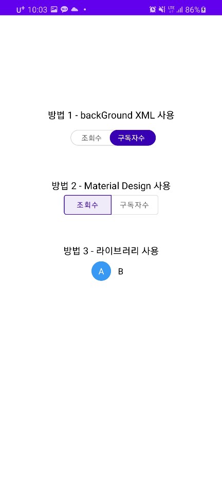
1. background XML 사용
뷰의 background을 설명하는 xml 파일을 만들어서 클릭 됐을 때 적용하는 방식이다.
필요한 것
1. 레이아웃 파일
2. 두 개의 background xml 파일 (두 개 버튼 감싸는 배경, 선택 됐을 때 배경)
3. 클릭된 뷰를 강조하기 위한 자바 파일
- 레이아웃 파일
클릭될 텍스트 뷰 2개와 해당 뷰들을 감싸는 LinearLayout으로 구성된다.
<androidx.constraintlayout.widget.ConstraintLayout
        android:layout_width="match_parent"
        android:layout_height="match_parent"
        tools:context=".ToggleBtActivity">
        ----

        <LinearLayout
            android:id="@+id/xmlLinear"
            android:layout_width="wrap_content"
            android:layout_height="wrap_content"
            android:layout_marginStart="8dp"
            android:layout_marginTop="16dp"
            android:background="@drawable/item_bg_outline"
            app:layout_constraintStart_toStartOf="parent"
            app:layout_constraintEnd_toEndOf="parent"
            app:layout_constraintTop_toBottomOf="@+id/method1TV"
            android:layout_marginLeft="8dp">

            <TextView
                android:id="@+id/viewTv"
                android:layout_width="wrap_content"
                android:layout_height="match_parent"
                android:text="@string/views"
                android:textColor="@color/white"
                android:gravity="center"
                android:textSize="14dp"
                android:paddingTop="5dp"
                android:paddingStart="20dp"
                android:paddingEnd="15dp"
                android:paddingBottom="5dp"
                android:background="@drawable/item_bg_on"
                tools:ignore="RtlSymmetry"
                android:paddingLeft="15dp" android:paddingRight="10dp"/>

            <TextView
                android:id="@+id/subScriberTv"
                android:layout_width="wrap_content"
                android:layout_height="match_parent"
                android:text="@string/subscriber"
                android:gravity="center"
                android:textSize="14dp"
                android:paddingStart="15dp"
                android:paddingTop="5dp"
                android:paddingEnd="20dp"
                android:paddingBottom="5dp"
                android:textColor="@color/text_gray"
                android:paddingLeft="10dp"
                android:paddingRight="15dp"/>
    </LinearLayout>
</androidx.constraintlayout.widget.ConstraintLayout>
- 2개의 background XML
xml 파일에는 background의 둥그런 정도(radius), 경계선(stroke) 너비와 색상, 전체(solid) 색상 등을 정의한다.
두 개의 뷰를(조회수, 구독자수) 감싸는 뷰의 background에 적용될 xml 파일이다.
<shape xmlns:android="http://schemas.android.com/apk/res/android">
    <solid android:color="@android:color/transparent"/>
    <corners android:radius="15dp"/>
    <stroke android:width="1dp" android:color="@color/filter_line"/>
</shape>
선택된 뷰의 background에 적용될 xml 파일이다.
<shape xmlns:android="http://schemas.android.com/apk/res/android">
    <solid android:color="@color/colorPrimary" />
    <corners android:radius="36dp"/>
</shape>
- 클릭 이벤트
다음은 java 파일에서 뷰('조회수' 또는 '구독자수')가 클릭됐을 때 true, 구독자수가 클릭됐을 때 false를 인자로 갖는 함수이다.
이 함수를 통해 클릭된 뷰가 강조된다.
0은 background 속성을 없에준다.
private void setXMLToggle(boolean isViewClicked){
        if (isViewClicked){
            binding.viewTv.setTextColor(getResources().getColor(R.color.text_gray));
            binding.viewTv.setBackgroundResource(0);
            binding.subScriberTv.setTextColor(getResources().getColor(R.color.white));
            binding.subScriberTv.setBackgroundResource(R.drawable.item_bg_on);
        }else{
            binding.viewTv.setTextColor(getResources().getColor(R.color.white));
            binding.viewTv.setBackgroundResource(R.drawable.item_bg_on);
            binding.subScriberTv.setTextColor(getResources().getColor(R.color.text_gray));
            binding.subScriberTv.setBackgroundResource(0);
        }
}
1번 방법의 장단점
장점 : 디자인 (색상, 둥근 정도, 경계선)을 직접 만들 수 있다.
단점 : 작업이 상대적으로 많이 필요하다. (xml 파일 최소 2개 이상, 클릭 이벤트를 위한 java 코드)
2. Material Design 사용
Material Button을 사용하면 토글 버튼을 쉽게 구현할 수 있다. 그리고 이쁘다.
필요한 것
1. 라이브러리 gradle 파일에 추가하기
2. style 만들고 액티비티의 theme 속성에 추가하기
3. 레이아웃 파일
- 라이브러리 gradle 파일에 추가하기
버전은 최신버전으로 해주세요~
implementation 'com.google.android.material:material:1.2.1'
- style.xml 만들고 액티비티의 theme 속성에 추가하기
특이사항으로 Theme.MaterialComponents.*을 상속받는 theme이 액티비티 속성에 포함되어야 한다.
기본 theme을 사용하면 material button이 보이지 않는다.
액티비티 속성은 manifest.xml 파일에서 할 수 있다.
<style name="MaterialAppTheme" parent="Theme.MaterialComponents.Light.NoActionBar">
        <item name="colorPrimary">@color/colorPrimary</item>
        <item name="colorPrimaryDark">@color/colorPrimaryDark</item>
        <item name="colorAccent">@color/colorAccent</item>
</style>
--
Note:<Button> is auto-inflated as <com.google.android.material.button.MaterialButton>
via MaterialComponentsViewInflater when using a non-Bridge Theme.MaterialComponents.* theme.
** Fragment에서 사용할 경우 주의사항
fragment의 경우 ContextThemeWrapper를 사용한 inflater를 사용해야 위에서 만든 스타일이 적용된다.
onCreateView() 생명주기일 때 사용하면된다.
// create ContextThemeWrapper from the original Activity Context with the custom theme
final Context contextThemeWrapper = new ContextThemeWrapper(getActivity(), R.style.MaterialAppTheme);
// clone the inflater using the ContextThemeWrapper
LayoutInflater localinflater = inflater.cloneInContext(contextThemeWrapper);
View rootView = localinflater.inflate(R.layout.fragment_agent_check_popup, container, false);
- 레이아웃 파일
<com.google.android.material.button.MaterialButtonToggleGroup
            android:id="@+id/toggleButton"
            android:layout_width="wrap_content"
            android:layout_height="wrap_content"
            app:layout_constraintTop_toBottomOf="@+id/materialTv"
            app:layout_constraintStart_toStartOf="parent"
            app:layout_constraintEnd_toEndOf="parent"
            app:singleSelection="true"
            app:selectionRequired="true">


            <Button
                android:id="@+id/button1"
                android:layout_width="wrap_content"
                android:layout_height="wrap_content"
                android:text="@string/views"
                style="?attr/materialButtonOutlinedStyle"
            />
            <Button
                android:id="@+id/button2"
                android:layout_width="wrap_content"
                android:layout_height="wrap_content"
                android:text="@string/subscriber"
                style="?attr/materialButtonOutlinedStyle"
            />

</com.google.android.material.button.MaterialButtonToggleGroup>
- 2번 방법의 장단점
장점 : 1번에 비해 상대적으로 간편하게 구현 가능, 이쁘다...
단점 : 타원형 또는 원형으로 만드는 방법을 아직은 모르겠다... 과연 있는것일까?
xml 디자인 미리보기(preview)에서 안보인다.. 개발할 때는 모르지만 빌드하고 나서 보인다... 해결책 아시는 분..

3. 라이브러리 사용
다른 사람이 이쁘게 잘 만들어 놓은 라이브러리를 사용해서 만들 수 있다.
이번에 사용할 라이브러리는 다음과 같고, 잘 만들어 주셔서 감사합니다~
github.com/nex3z/ToggleButtonGroup
nex3z/ToggleButtonGroup
A group of flowable toggle buttons, with multiple / single selection support and button customization. - nex3z/ToggleButtonGroup
github.com
필요한 것
1. gradle 파일에 의존성 추가
2. 레이아웃 파일에 추가
- gradle 파일에 의존성 추가
implementation 'com.nex3z:toggle-button-group:1.2.3'
- 레이아웃 파일에 추가
 <com.nex3z.togglebuttongroup.SingleSelectToggleGroup
            android:id="@+id/group_choices"
            android:layout_width="wrap_content"
            android:layout_height="wrap_content"
            app:tbgCheckedButton="@+id/choice_a"
            app:layout_constraintStart_toStartOf="parent"
            app:layout_constraintEnd_toEndOf="parent"
            android:layout_marginTop="8dp"
            app:layout_constraintTop_toBottomOf="@+id/libraryTv">

            <com.nex3z.togglebuttongroup.button.CircularToggle
                android:id="@+id/choice_a"
                android:layout_width="wrap_content"
                android:layout_height="wrap_content"
                android:textSize="16sp"
                android:text="A"/>

            <com.nex3z.togglebuttongroup.button.CircularToggle
                android:id="@+id/choice_b"
                android:layout_width="wrap_content"
                android:layout_height="wrap_content"
                android:textSize="16sp"
                android:text="B"/>


</com.nex3z.togglebuttongroup.SingleSelectToggleGroup>
- 3번 방법의 장단점
장점 : 제일 간편하다. 이쁘다. 여러 기능을 제공한다. 다중 선택 기능은 정말 쓸 만할 듯하다
단점 : 자유도가 제한된다, 커스텀하기가 어렵다. 그대로 사용하지 않은 이상 직접 만드는게 더 편할 듯하다.
'Android > 개념 및 예제' 카테고리의 다른 글
| [Android] 카카오 로그인을 안드로이드 앱에 연동하기 (0) | 2021.01.10 |
|---|---|
| [Android] 네이버 로그인을 안드로이드 앱에 연동하기 (6) | 2021.01.05 |
| ConstraintLayout 이해, 정복하기 (0) | 2020.09.06 |
| Android Notification Example (+Channel) (0) | 2020.08.13 |
| 모서리가 둥근 ImageView, Button, TextView 만들기 (0) | 2020.08.13 |


